In 1983, Congress passed legislation that established the Medicare Hospice Benefit, providing people enrolled in Medicare (Medicare beneficiaries) with access to palliative end-of-life care. The program was designed for people with terminal illness diagnoses—in particular, people with a life expectancy of six months or less (Caring Hospice Institute, 2025). In the early years of hospice, most beneficiaries opting for hospice were of terminal cancer diagnoses; however, the proportion of hospice patients with non-cancer diagnoses has grown. This marks a larger trend toward palliative care for end-of-life care, focusing more on pain management than aggressive curative services.
Hospice has grown significantly in the last few decades. In 1992, less than 9% of Medicare beneficiaries died in hospice. By 2000, the number had more than doubled, rising to 22% (Medicare Payment Advisory Commission, 2002). By 2015, 46% of Medicare beneficiaries died in hospice (U.S. Department of Health and Human Services, 2015). While the pandemic caused a hiccup in this trend, the figure floats near 50% today: a massive uptick in hospice usage in the last 40 years.
The implications for the growth of hospice enrollment are numerous. One consideration is spending. Due to hospice’s growth, a quarter of all Medicare spending now goes toward hospice care. This, however, is simply a product of its growth in usage as opposed to hospice as an expensive service. Perhaps somewhat counter intuitively, studies have found that earlier enrollment in hospice tends to reduce spending per Medicare-beneficiary, particularly when patient stays are longer than 10 days (National Hospice and Palliative Care Organization, 2023). Hospice reduces beneficiaries’ long, expensive (and frequent) hospitalizations, prioritizing comfort and symptom management in patients’ end-of-life.
Hospice’s cost-effectiveness does not come at the expense of patient and family satisfaction. Surveys of families of hospice patients often reveal a common sentiment: many wish they had chosen to move their family member into a hospice center sooner. Survey data indicate a similar sentiment. From national surveys conducted from April 2022 to May 2024, 84% of respondents said they would definitely recommend hospice, 11% said they would probably recommend hospice, and just 5% said they would probably not or definitely not recommend hospice (Centers for Medicare & Medicaid Services, 2024). Additionally, 90% of respondents said that the hospice team provided the right amount of emotional and spiritual support (Centers for Medicare & Medicaid Services, 2024). Families are overwhelmingly satisfied with the palliative care their family member received.
Given that hospice is cost effective, growing, and generally well-liked among families of hospice-enrolled patients, what is the problem? Put simply, patients are moved into hospice too late. National Association for Home Care & Hospice President William Dombi notes, “Hospice stays of less than 15 days don’t give enough time for patients and families to benefit fully from the person-centered care that hospice provides. Yet, 50 percent of hospice patients receive 17 days or less of hospice care” (National Hospice and Palliative Care Organization, 2023) Hospice provides an opportunity for Medicare to save money (in a time where they are running out of cash) and improve patient outcomes; however, half of hospice patients are unable to reap the full benefits of this program.
This project intends to investigate how hospices outcomes differ across the U.S., evaluating states on a variety of hospice performances metrics and survey data. By doing this, I will speak about relevant variables to hospice success, understanding which states perform well in hospice and which states could improve. Finally, I hope to make broader conclusions about hospice in the United States.
Part 1: Cost Considerations, Enrollment, and Medicare
Given that hospice constitutes such a large proportion of Medicare costs, understanding how per-beneficiary spending differs in different states is key to this discussion. Per-beneficiary spending refers to the total cost of care / the number of Medicare beneficiaries (i.e., people on Medicare) who enrolled in hospice. The national average of per-beneficiary hospice spending is $17,830. However, the plot below demonstrates the vast disparity between in the highest- and lowest- spending states.
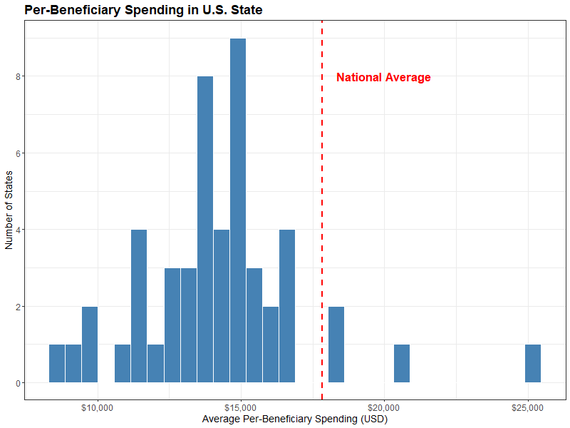
This graph should naturally motivate the question: why are there only four states whose average per-beneficiary spending exceeds the national average?
The four states that exceed the national average per-beneficiary spending are (from left to right) Texas, Arizona, Nevada and California. These states have a combined Medicare enrollment of 12,484,212, accounting for almost a quarter of all Medicare beneficiaries. This can be compared starkly to the Medicare population of the four lowest per-beneficiary spending states—Kentucky, North Dakota, South Dakota, Wyoming—of just 1,292,554. Texas and California large hospice populations and high spending increase the national average per-beneficiary spending.
While I used Medicare enrollment as a crude measurement of hospice population above, an important point must be made—the percentage of Medicare beneficiaries who die in hospice is vastly different across U.S. States. See the graph below that compares states’ Medicare enrollment and the percent of beneficiaries who enroll in hospice.
Hovering over any given state shows its per-beneficiary spending, Medicare population, and percent of beneficiaries who died in hospice. New York, despite having the fourth largest Medicare population in the country (3,367,359 people), has only 24.7% of Medicare beneficiaries enrolling and dying in hospice. This differs drastically from a smaller state like Utah, with a Medicare population of just 382,040 and 60.7% of this cohort dying in hospice. The plot also includes a gradient for per-beneficiary spending, with California as a major spending outlier among U.S. States.
This plot introduces major questions related to differing hospice enrollment across the country. Why is California paying so much per-beneficiary? Does paying more lead to better health outcomes? Why are there such disparities in hospice enrollment rates in different states? Do states with higher hospice enrollment have higher satisfaction with hospice? To begin to answer these questions, it is necessary to discuss some of the metrics used to evaluate hospice success.
Part 2: Burdensome Transitions, Live Discharges, and The Hospice Care Index Overall Score
The census offers many metrics by which hospice centers can be assessed. The Centers for Medicare and Medicaid Services has developed a metric called the Hospice Care Index, which evaluates hospice providers on a scale from 0 to 10 using ten indicators of quality and compliance. While each component captures a different aspect of care, this composite score offers a look into hospice performance across the country. The ten metrics are as follows:
- Continuous Home care (CHC) or General Inpatient (GIP) Provided.
- How well do hospice centers manage more intense symptoms? This number is the percent of days for which CHC or GIP is provided for a hospice stay.
- Gaps in Skilled Nursing Visits
- How attentive and responsive are hospice providers? This serves as an indicator for neglect, resource shortages, or inadequate staffing. This number is the percent of hospice patients who stayed 30+ days who had 7+ day gaps in skilled nursing visits.
- Early Live Discharges
- What percent of live hospice discharges occur within the first 7 days of hospice stays? This includes those who opt out of hospice as well as discharges in which the hospice centers initiate patient discharge.
- Late Live Discharges
- What percent of live hospice discharges occur after 180 days of hospice stay? This often serves as an indicator that hospice centers are admitting people who meet admission criteria (i.e., terminal illness with life expectancy <6 months).
- Burdensome transitions (type 1)
- What percent of live hospice discharges involve a hospital admission within two days of hospice discharge with subsequent hospice readmission? This is a burdensome transition as it places additional strain on families and patients’ end-of-life care.
- Burdensome transitions (type 2)
- What percent of live hospice discharges involve a hospital admission within two days of hospice discharge with the patient dying in the hospital? This is a burdensome transition as it indicates that the patient likely should not have been discharged from hospice.
- Per-Beneficiary Medicare Spending
- How much do hospice centers spend per hospice patient? I.e., how much money is the center spending.
- Skilled Nursing Care Minutes per Routine Home Care (RHC) day
- How well are hospice centers assessing patient needs? This number measures the average number of skilled nursing minutes per day during routine home care days.
- Skilled Nursing Minutes on Weekend RHC Days
- How well are healthcare services available on the weekend? This number indicates the average number of skilled nursing minutes on weekend RHC days.
- Visits Near Death
- When a patient is near the end of their life, how much additional care are they receiving? This metric measures the percent of patients who receive a visit by a skilled nurse in the last three days of their life.
These metrics relate to many key questions in hospice care—how are patients being discharged, what is the quality of patients’ care while in hospice, and, of course, the ($25.8) billion dollar question: how much do patients cost. Note that all of these metrics are measured at the hospice-center level and aggregated to the state level in this analysis. To see how U.S. States perform in these ten metrics, along with the Hospice Care Index, interact with the plot below.
There are numerous insights that can be made from these plots. For one, the five states that have the lowest Hospice Care Index Overall Score include the four highest per-beneficiary spenders discussed earlier. Of course, per-beneficiary spending is one of ten variables included in the index. The correlation is still rather startling. Are these states rated low in the HCI because of the spending, or is high spending correlated with other aspects of poor hospice care?
The CHC and GIP provided also reveals quite an interesting outlier—Florida. While most U.S. States CHC/GIP provided is less than 1%, Florida’s is nearly 3%. States like North Carolina, Kentucky, and Wyoming also stick out as above average in this metric. This indicates that these states are providing more continuous home care and general in-patient for a given hospice stay.
Finally, I would like to highlight the two burdensome transitions. For Type 1, there seems to be a regional trend, with the Southeast having some of the highest rates of type 1 burdensome transitions. This regional trend is less present in type 2 burdensome transitions (generally considered worse), in which Vermont and New York lead the country in these types of discharges.
Burdensome transitions are relevant for numerous reasons. Discharges generally are unfavorable outcomes, and burdensome transitions are examples of how discharges can be harmful. In addition to disrupting palliative care, they result in extra cost by incurring additional hospital bills and causing additional stress for patients and primary caregivers. They are important indications of how hospice centers evaluate patients’ prognosis. The following chart compares type 1 burdensome transitions (being admitted to a hospital within two days of hospice discharge with subsequent hospice readmission) and type 2 burdensome transitions (being admitted to a hospital and dying within two days of hospice discharge).
This graph compares type 1 and type 2 burdensome transitions, also mapping Medicare enrollment population to the size of the points and the Hospice Care Index—the general hospice success metric—mapped to the the gradient.
As noted before, New York and Vermont see the highest type 2 burdensome transition rate. States like Mississippi and Alabama have high rates of both types of burdensome transitions—likely indicators that these states are poorer at assessing patient prognoses. They are discharging patinets who are being admitted to hospitals within a short time period. States that are effective in limiting burdensome transitions include Wyoming, Utah, West Virginia, and Iowa.
Burdensome transitions are incredibly important indicators of hospice success. However, the hospice care index does not reflect the importance of these discharges. Arizona, a state with one of the lowest rates of type 2 burdensome transitions, has a lower HCI score than Alabama, a state tied for the 3rd highest type 2 % and the 3rd highest type 1 %. Of course, Arizona pays more per-beneficiary than most states. Does this mean that they should have a lower HCI despite reducing these unfavorable discharges? This motivates the question: which of the ten variables impacts HCI the most?
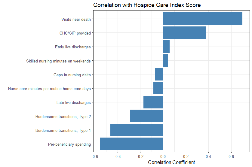
As previously noted, per-beneficiary spending is a large contributor to the hospice care index overall score. Burdensome transitions, types 1 and 2, have correlation coefficient values of r = -0.46 and r = -0.29, respectively. Continuous home care / general in-patient provided also has a fair degree of correlation (r = -0.38). However, the highest degree of correlation corresponds to Visits near death (r = 0.70). This metric refers to the percent of patients in a given hospice care facility who receive a visit by a skilled nurse in the last three days of their life. This metric encapsulates quality of end-of-life care—are patients getting the proper amount of attention as they near the end of their life? Visits near death also serves as measure of if hospice centers are properly equipped, staffed, and trained to manage end-of-life care.
While the hospice care index encapsulates certain elements of hospice care well, it does not serve as the most fair assessment of palliative care. Per-beneficiary spending is certainly an important metric in evaluating hospice success. Cost efficiency is understood to be an advantage and goal of hospice care, and excessive spending can be an indication of high discharge rates and long hospice lengths of stay. However, there is nuance to these figures. Given that California has a higher cost of living than much of the U.S., it is without surprise that they have to spend more per-beneficiary. Staffing hospice facilities is considerably more expensive in California than other parts of the country. Nuance must be given for visits near death as well. This metric gauges care at the end of one’s life, particularly in the last three days. However, this may not encapsulate the quality of care for the entire length of a patient’s hospice stay. Additionally, by implicitly controlling on those who have died in hospice, this metric may overlook broader issues related to patient retention, early discharges, or disparities in access. It focuses only on those who remained in hospice until death, potentially ignoring patients who were discharged prematurely or transferred elsewhere. As a result, this measure might paint an incomplete picture of hospice quality, emphasizing care in the final days without accounting for consistency or adequacy of care throughout the entire stay. Attempting to assign a single number on the quality of hospice care is an impossible task. Additionally, remember that these values are meant to be assigned to single hospice-care centers (these scores have simply been aggregated to the state level). For these reasons, it is necessary to understand the HCI metric in a more nuanced manner.
Part 3: Perception and Reality
The census collects many objective metrics designed to evaluate hospice-care centers. They also collect survey data. The Consumer Assessment of Healthcare Providers and Systems Hospice Survey (CAHPS) asks questions to the informal caregivers of patients (often family members). These questions hope to reveal elements of care beyond the clinical and administrative metrics presented in Part 1. Additionally, insights from survey data can provide some necessary context to the Hospice Care Index and its limitations.
The questions asked in this survey are as follows (with the levels of the question below):
- Did the hospice team provide the right amount of emotional support?
- The hospice team did |not| provide the right amount of emotional and spiritual support, the hospice team provided the right amount of emotional and spiritual support.
- How would you rate the hospice agency?
- Caregivers rate the hospice agency a 6 or lower, caregivers rate the hospice agency a 7 or 8, caregivers rate the hospice agency a 9 or 10.
- Would you recommend the hospice agency?
- No—they definitely would not recommend the hospice, yes—they would probably recommend the hospice, yes—they would definitely recommend the hospice.
- Did the hospice treat the patient with respect?
- The hospice team sometimes or never treated the patient with respect, the hospice team usually treated the patient with respect, the hospice team always treated the patient with respect.
- How often did the patient receive the help they needed for pain and symptoms?
- The patient sometimes or never got the help they needed for pain and symptoms, the patient usually got the help they needed for pain and symptoms, the patient always got the help they needed for pain and symptoms.
- How well did the hospice team communicate?
- The hospice team sometimes or never communicated well, the hospice team usually communicated well, the hospice team always communicated well.
- How often did the hospice team provide timely help?
- The hospice team sometimes or never provided timely help, the hospice team usually provided timely help, the hospice team always provided timely help.
- Did the hospice team receive the training they needed?
- They did not receive the training they needed, they somewhat received the training they needed, they definitely received the training they needed.
These survey questions highlight a number of concerns related to hospice. Broadly, they assess whether the end of the patient’s life was well-supported in hospice. In particular, I would like to highlight the question, “How often did the hospice team provide timely help?” This question encapsulates a priority of hospice care—timely care in the context of symptom management and emotional support. Additionally, I would like to look further at the Visits Near Death variable, as this metric attempts to capture a similar concern In the visualization below, the Visits Near Death variable is mapped to the gradient on the states. When hovering on each state, you can see the distribution of the levels of survey response for each state.
California and Nevada have two of the lowest rates of patients who received a skilled nurse visit in their last 3 days of life, with 83.4% ad 83.2% respectively. Both states have a fairly similar distribution of the levels of the survey question, with around ~70% saying the hospice team always provided timely help, ~17% saying that the hospice team usually provided timely help, and ~13% saying that the hospice team sometimes or never provided timely help. This differs from some of the highest Visits Near Death states, like Wisconsin and Nebraska, which have splits that look closer to 80%, 10%, and 10% for the three respective levels.
Generally, it does seem that states with a lower percentage of visits in the last 3 days of life (%) have lesser satisfaction than those with higher percentages of visits. This relationship becomes more clear when using a scatter plot, showing the percent of caregivers who said that the hospice always provided timely help and the percent of patients who received skilled nurse visits in the last three days of life.
There does exist a weak relationship (r=0.31) between these two variables. California and Nevada, two countries with the worst rate of visits in the last three days, are among the states with the lowest “always provided timely help” percentage. However, Florida, despite having a high visits in last three days of life, is tied with California in terms of their poor “always provided timely help” rate among caregivers. This aligns with the earlier claim—visits in last 3 days provides an imperfect look into how caregivers and patients perceive the care they are receiving.
Of course, this can be understood in a broader context: patient and family satisfaction cannot simply be quantified by a single number. While the ten metrics discussed earlier give a picture into how each hospice care differs, it may not track with how patients perceive the quality of their palliative care. It is worth noting that the CAHPS Hospice Survey data is a national survey of family members or friends who cared for a patient who died while under hospice care. This therefore has conditioned on those who died in hospice care (similar to a quality of the visits near death metric). For example, patients who experienced a type 2 burdensome transition (died in hospital shortly after hospice discharge) would not have been included in this survey data. Put simply, it is an incomplete—but still quite useful—snapshot of hospice care.
The following visualization will allow for more interaction with the survey data. It will cycle through all of the highest level of each survey questions when the play button is pressed, showing the percent of respondents who opted for the highest degree of satisfaction for the given question. Also displayed are the three states with the highest and lowest percent satisfaction with the questions. Finally, the degree of correlation with the Hospice Care Index is displayed, hoping to give some indication with how well these metrics map to this objective metric.
Generally, the correlation between HCI and survey responses are weak. Florida serves as a prime example—despite boasting the second highest Hospice Care Index score in the among U.S. states, their hospice care seems to have relatively poor reception among those surveyed. In fact, they are in the bottom three states for all eight of the given questions. Why is there such a discontinuity?
In some instances, the top and bottom three states have very little difference between them. For example, in the question “The hospice team provided the right amount of emotional and spiritual support,” Alaska, Idaho, and Wyoming are tied at 93% while Florida is the lowest at 87%. That difference is quite small.
Some survey questions lend well to correlating with the census-recorded metrics. For example, the question “The hospice team always provided timely help” seems like it can be measured with metrics like “Visits in last 3 days of life” or the two “Skilled Nursing Minutes” data. Of course, caregivers’ understandings of timely help differ, but there are variables that can be used to roughly quantify how much help patients received. Other elements of care, such as whether caregivers thought “The hospice team always communicated well” or “The hospice team provided the right amount of emotional and spiritual support” is harder to quantify in the Medicare claims data. The data being encapsulated in much of this survey data relates more to the caregivers’ perception of care, while the variables used in the HCI relate more to Medicare costs and broader looks into how patients are admitted, how long they stay, and when they are discharged. Also, as noted earlier, the survey is only administered to caregivers of patients who died in hospice. This has conditioned on patients who die in hospice, excluding patients such as those who experienced a type 2 burdensome transition (i.e., moved to hospice, discharged, then died in hospital). These patients’ caregivers would likely have negative things to say about their hospice experience; however, they are not surveyed. This may skew results to look more positive for states who have a large population of patients who were once admitted but did not die in hospice.
Finally, it is worth noting that there are some flaws in how these survey data are collected. There seems to be quite a bit of hospice-center level missingness in terms of the hospice data (as many as 26% of hospice centers). In this dataset, the census simply imputed the missingness with national survey averages (National Association for Home Care & Hospice, 2024). This operates on a lofty assumption of missing completely at random, assuming that the centers that have not been surveyed in a while are a random sample of the number of hospice centers in the country. It is possible that the missing data are a poorer performing subset of hospice care facilities, as surveying caregivers from these locations may be more difficult and resource intensive. This may skew certain states closer to the national average.
Part 4: Conclusions
Hospice care in the United States has seen significant growth since its inception over 40 years ago. This project reveals how, at a state level, there exists large gaps in how hospice performs. From New York’s enrollment rate that is 25 points below the national average to the vast differences in per-beneficiary costs between the highest spending and lowest spending states, there is much that can be understood about how different states’ hospice centers perform.
The clinical indicators—particularly the ten metrics used to calculate the HCI—give an interesting view into how care differs across the country. It raises important and necessary questions about spending, quality of patient prognosis, resource allocation, staffing, and numerous other elements of hospice care. These metrics provide objective looks into how hospice centers perform, allowing one to ask questions like, “Is the hospice center have enough staff to handle the amount of patients they see?” or “How effectively is this hospice center admitting patients based on the Medicare criteria for hospice admission?”
It is worth highlighting the human-element of hospice care. While the Hospice Care Index attempts to encapsulate the quality of hospice care, there seem to be incongruities with how patients and caregivers rate their hospice stay. While some states like Florida tend to perform well in many of the HCI indicators, survey data seem to indicate dissatisfaction with hospice care. Hospice is intended to aid patients at a difficult time in their life, including in pain management as well as the emotional and spiritual aspect of their end-of-life care. This human side of hospice care cannot be encapsulated in Medicare claims data metrics, and the survey data help to provides some insight into the quality of end-of-life care. Caregivers are able to express how they felt the patient was treated, how their end-of-life was aided by hospice care, and generally if hospice was a good experience. In many ways, these survey data perfectly encapsulate the many stated goals of hospice. However, limitations including missingness and the nature of the sample of the survey make potential conclusions about states’ hospice care cloudy.
Further analysis could involve data on a more local level, such as the county-level. Because there are vast differences in socioeconomic statuses of patients within states, it can be difficult to make broad conclusions while simply aggregating all hospice centers from one state. At a more local-level, factors like income, population density, and healthcare access’s influence on hospice quality can be better understood in how they influence hospice outcomes. Another important consideration is that the decision to be moved to hospice is often facilitated by a doctor’s recommendation. A more bottom-up approach to hospice care could be explored, understanding what contributes to more regular doctors visits and thus more accurate patient prognoses. This relates to the Dombi quote about the importance of moving people into hospice earlier so they can experience longer, higher quality palliative care. Interesting discussions could also relate to communities’ trust in doctors and medicine, as well as challenges related to moving people to hospice. Recommendation to be moved to hospice can come during a tumultuous time in a patient’s life, and the decision to enter palliative care is a difficult one. Understanding how to better facilitate this transition is essential to increase hospice enrollment in the future.
Leave a Reply